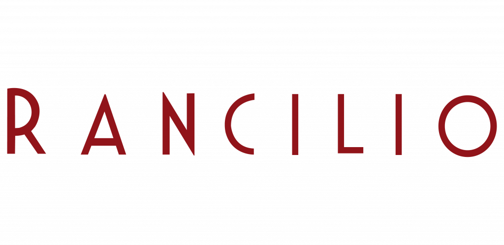
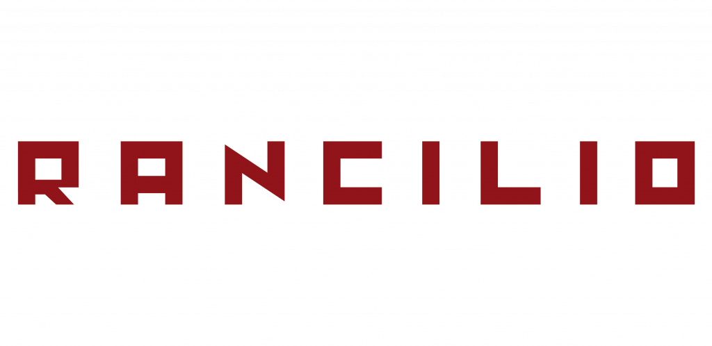
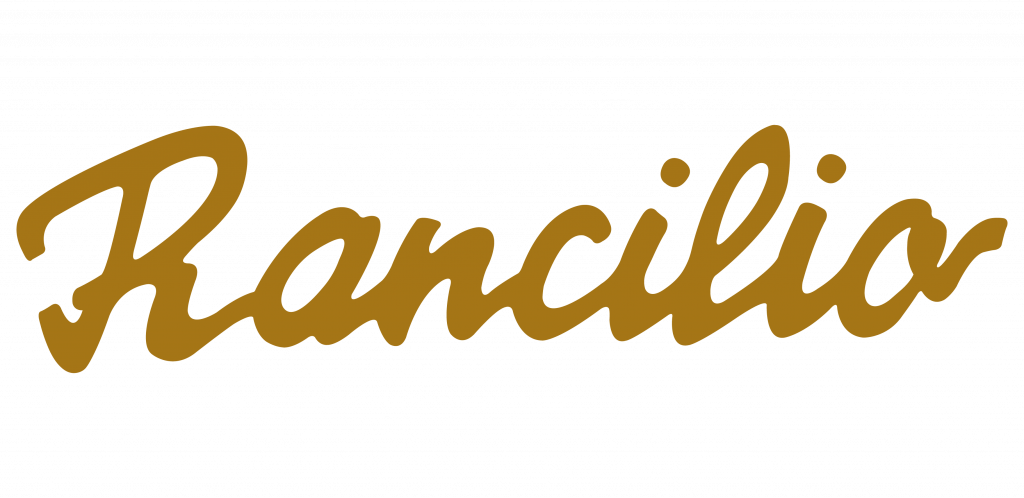
OUR LOGOS

The history and the evolution
of the logos


A journey through time that tells the story of a man,
pioneer and visionary.
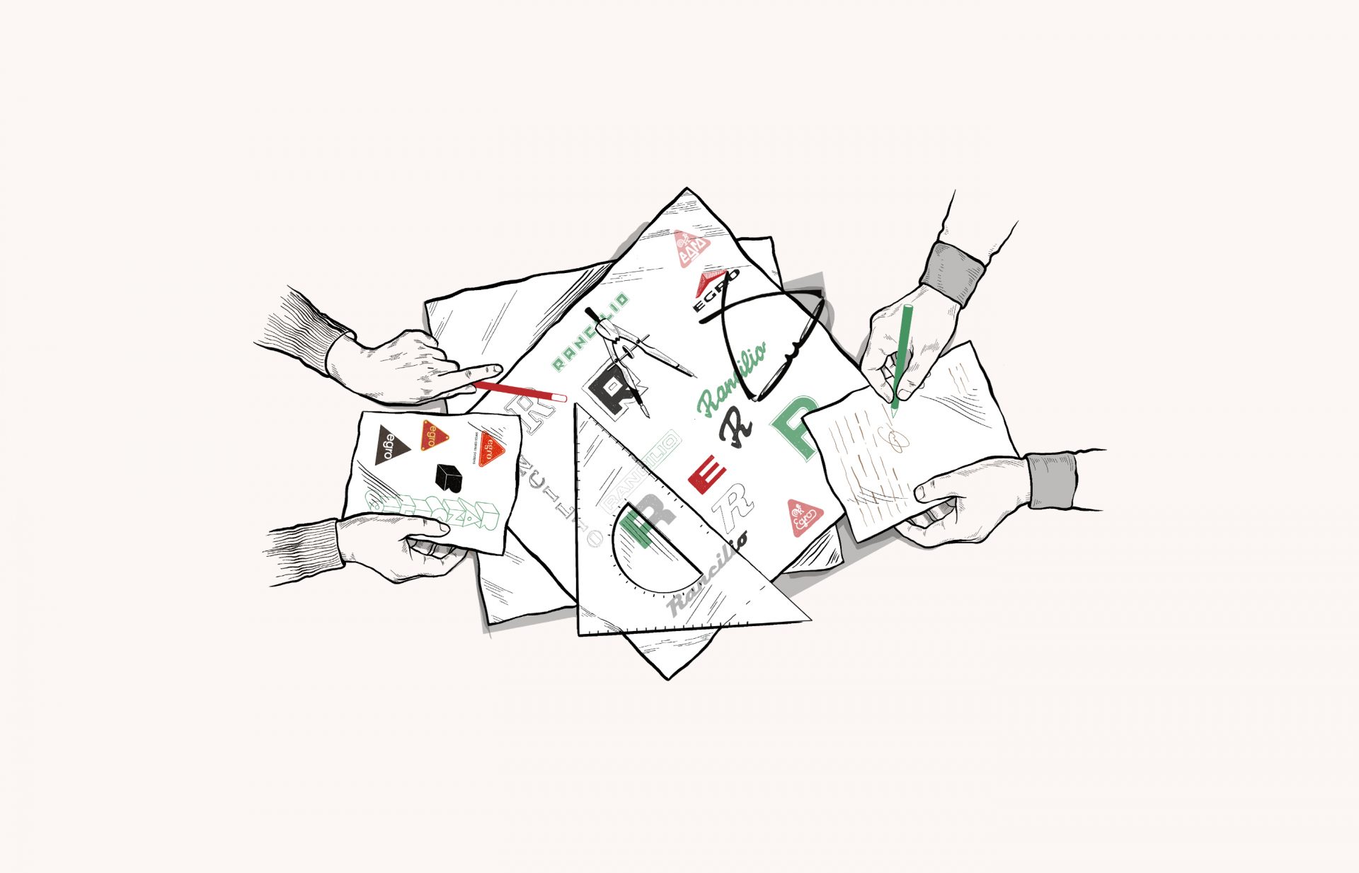
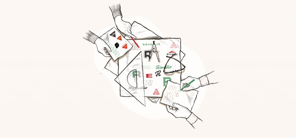
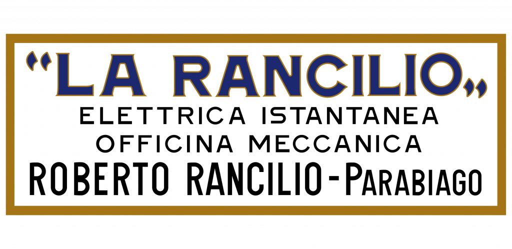
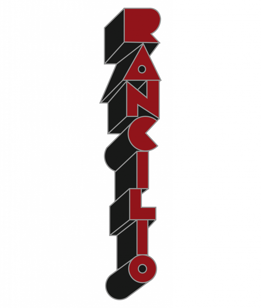
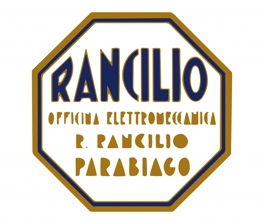
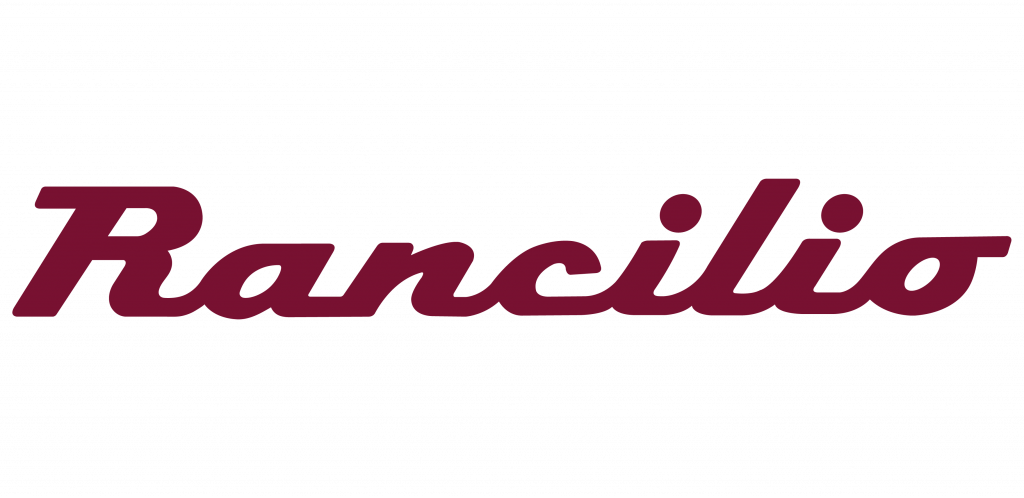


1927

In 1927, the first coffee machine for bars by Rancilio is produced, with all the determination and technical skills of Roberto Rancilio. La Regina, «The Queen», is its name and Roberto, acknowledging the importance of reminding his real clients  – the café owner and the barista – of who is behind the equipments, decides to place his monogram at their sight, on its cup support.

1927
1927

This monogram, crafted on metal by hand, is the starting point of the company’s identity and will also be of great importance in the future, being the base of all Rancilio’s communication. At this time, it is however placed not only on La Regina, but also on the machines that succeed it on the Thirties, consisting of two grotesque R’s, describing a 180º degree rotation towards each other and sharing the same vertical stem.

1927

Although, the monogram is not the only graphic element present on the equipments at this time. The words “La Rancilio” appear on this machine in an ultramarine blue lettering with golden outline, slightly more expanded than the original Copperplate Gothic typeface it was influenced by. In the small description placed bellow this lettering we can read, in golden grotesque letters “Elettrica Istantanea, Officina Meccanica”, and “Roberto Rancilio – Parabiago”, with similar characters but in a bigger size and more condensed.

1927
1930

In the Thirties, the brand stops being addressed as “La Rancilio”, appearing simply as Rancilio in the equipments. Nevertheless, the official company name, Officina Rancilio, will remain unchanged until the Fifties. But this is not the only change. In this decade, Art Deco is on vogue, and its aesthetical principles are embodied not only on the Ottogonale machine but also on the vertical lettering that is applied both to it, Graziosa and Invicta Verticale models.

1930
1930

This lettering, red and three-dimensional in what regards its shape, appears as if seen from below, being extremely heavy, geometrized and with almost no open spaces inside the letters. Display letterings sharing from these same characteristics are used a bit all over the western world in the decades of 1930 and 1940, mostly on posters and signs.

1930

However, another plate is sometimes used in the Ottogonale model. Shaped like a regular octagon, it has a pearl white background, featuring the Rancilio name in ultramarine blue with a golden outline, in a heavy display lettering, with pointed apexes and with its ends constricted by the angles of the plate. Golden is also used on the description written below, “Officina Elettromeccanica, R.Rancilio, Parabiago”, using characters similar to the ones displayed on the red plate, but more condensed.

1930
1948

At this time we are still able to observe Art Deco’s typographical influences, despite this style had ceased to be used after the start of World War II, in favor of more austere looks, regarding both colour and shapes.There is no photographical documentation of all the machines produced in this decade, but we can notice the presence of two different letterings in the existing records.

1948

The first appears on Ideale orizzontale in 1948, and also on Invicta orizzontale, in 1950. In this lettering, we can observe grotesque characters, light and condensed, with an exception being the letter O, an almost perfect circle. Incredibly similar letterings can be seen in posters from the Twenties and Thirties.

1948
1948

In the second lettering, that appears sometimes on Ideale orizzontale, we are also able to notice grotesque letters, heavy and quadrangular. These are very akin to the ones found in Constructivist posters and De Stijl alphabets, especially in these last, since the characteristic parallel and perpendicular lines of this movement are transferred to the letterings and typefaces.

1948
1948

In this decade some big changes happen, with the double R appearing for what seems to be the last time, on the cup support of Preziosa a leva. The official name of the company also changes, with the disappearance of word “Officina”, which indicates the definitive passage from an artisans’ workshop to a modern business. However, this change has no relevant visual repercussions – since the thirties, the company’s name only appears in a plate placed on the machine, very small and discreet.

1948

The letterings present on the equipments are renewed, with the first and third in order of appearance matching the aesthetics of Streamline, a typically American design movement, settled by the principles of speed. In fact, in this era the speed sets the tone for everything, including typography, being possible for us to observe plenty of scripts, cursive most of the time, and also italicized or slanted typefaces. The first lettering of this decade appears on Invicta orizzontale a Leva, consisting of a golden cursive script that creates a soft contrast when positioned against the silvery surface of the machine.

1948

This is the only plate in which Rancilio’s name appears written with a capital R followed by lower-case characters, which is completely natural, considering that a script mimics handwriting. Letterings like this one can be easily spotted in Forties and Fifties’ posters, mostly made in the USA. The Brush Script typeface, developed by Robert E.Smith in 1942, is likely one of the most recognisable faces of this era, sharing the same looks.

1948
1948

The third lettering is displayed on the Alpina and Ducale models, in red and white, respectively, and also in the Sixties, in the High Line series, in white, placed inside two overlapping rectangles, one red and the other black. This kind of lettering, commonly known as Connected Chrome Scrip is ubiquitous in almost all the chrome plates applied to cars and house appliances between the thirties and the sixties, being, in its essence, script characters united to one another through their baseline.

1948
1948

The second lettering of the decade presents itself on the models Mignon and Preziosa. These two machines, jewel-like in their appearance, display, perhaps for this same reason, a more conservative lettering, vertically oriented and burgundy coloured, fitting into the Egyptian/slab serif category that is though revisited, with the characters used on the machine having a significant contrast and monoserifs, on the apexes and vertexes of A and N and on R’s foot.

1948

This happens so that the letters can distance themselves from the remarkably masculine, heavy and low contrast stereotype of a slab serif. This category of faces are sometimes seen on Fifties’ posters, though seldom, because they don’t really fit into streamline visual codes.

1948
1948

In these two models there is also present a lettering, painted in gold on the Plexiglas plate of the cup-warmer, consisting of a grotesque outlined R, with a square bowl, intersected by the Rancilio name, written with light, grotesque and geometric characters. Though secondary, this element will be the base of the logotype that will be developed in the following decade.

1948
1965

Between 1965, the year in which High Line Series is launched, and the end of the decade, three other models are also released, displaying fresh plates. Eurostile, a milestone of the Italian typography of the twentieth century, starts to be used, in the bold extended variation.

1965
1965

This face assumes a major position in Rancilio’s communication between 1965 and the Eighties, appearing not only in the coffee machines’ plates, but also in every single printed material produced, though slightly different.

1965
1965

The print version of the logotype uses black colour, line and negative space, including also an outlined R, outside the rectangle in which the Rancilio name and the “Macchine per Caffè” payoff are inscribed. That R appears to be an evolution of the logotype found in Mignon and Preziosa’s Plexiglas.

1965
1982

The arrival of the Eighties brings novelties, with the original double-R monogram used till the Forties, being revived in 1982, however, changes go further beyond. The whole graphic communication is renewed and this same monogram, now the official icon of Rancilio, is placed near the verbal identity – these elements are arranged side by side, the double-R circumscribed inside a square and the company’s name inside a rectangle at the right of the former, both with rounded corners – setting up a whole new visual identity.

1982
1982

There are also typographical changes, with a lettering very similar to Helvetica, a face widely seen by the masses, being used now, linking harmoniously with the new shape of the monogram, simultaneously geometric and fluid. The changes made to the original face – rounding discreetly the sharp elements and eliminating the R’s foot- allow it to have the same optical width of the other letters, making the whole set to look friendlier and balanced.

1982

The printed version of the logotype is however complex and unbalanced, when compared with the plates’ version, displaying the payoff in positive, underlined and below the black rectangle that encloses the company name, featuring also the square with the monogram enlarged almost to the double of its original height. 

1982
1982

Colour is introduced also in this decade – the green is adopted to represent Rancilio – yet its use is present only in printed versions of the logotype.

1982
1982

In the Nineties the logotype is slightly readjusted, in three steps and almost unnoticeably. First, the lettering is substituted by the real Helvetica typeface that inspired the former one. Later, the double R is slightly thinned, getting a sharper look and then the green in use changes

2000

In 2000, Rancilio’s image gets retailored. There is a comeback to the company’s genesis, due to the union of the two primordial graphic elements present is the company history: the monogram, already in use since the eighties; and the brand name, written with the same typeface (Futura) that was once displayed on Officina’s façade. The payoff now is written in lower-case, being placed below the green rectangle.

2000
2005

Since 2005 the payoff is “Coffeeing the World”, a meaningful assertion of Rancilio’s objectives, to take the art and passion, not only of Italian espresso but also of all the coffee-based drinks, prepared with care and expertise, to every corner of the world. These words become even more special when written by Giorgio Rancilio’s hand, not only president of the company but also one of the faces of Rancilio’s third generation, being thus an expression of the family’s DNA and evolution.

2005

Explore the world behind

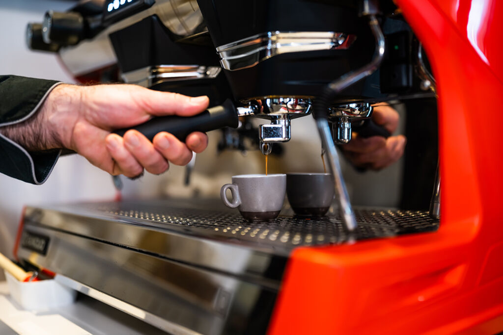
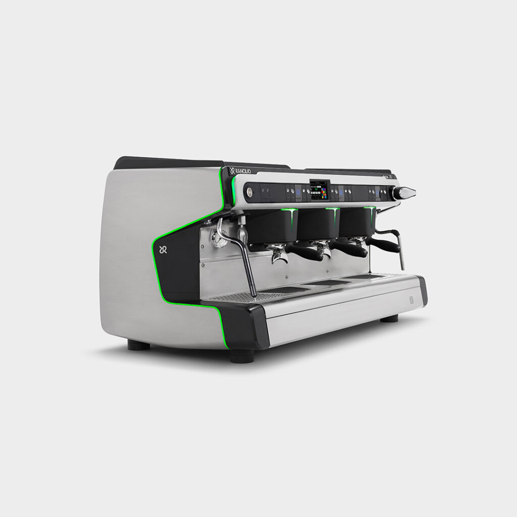
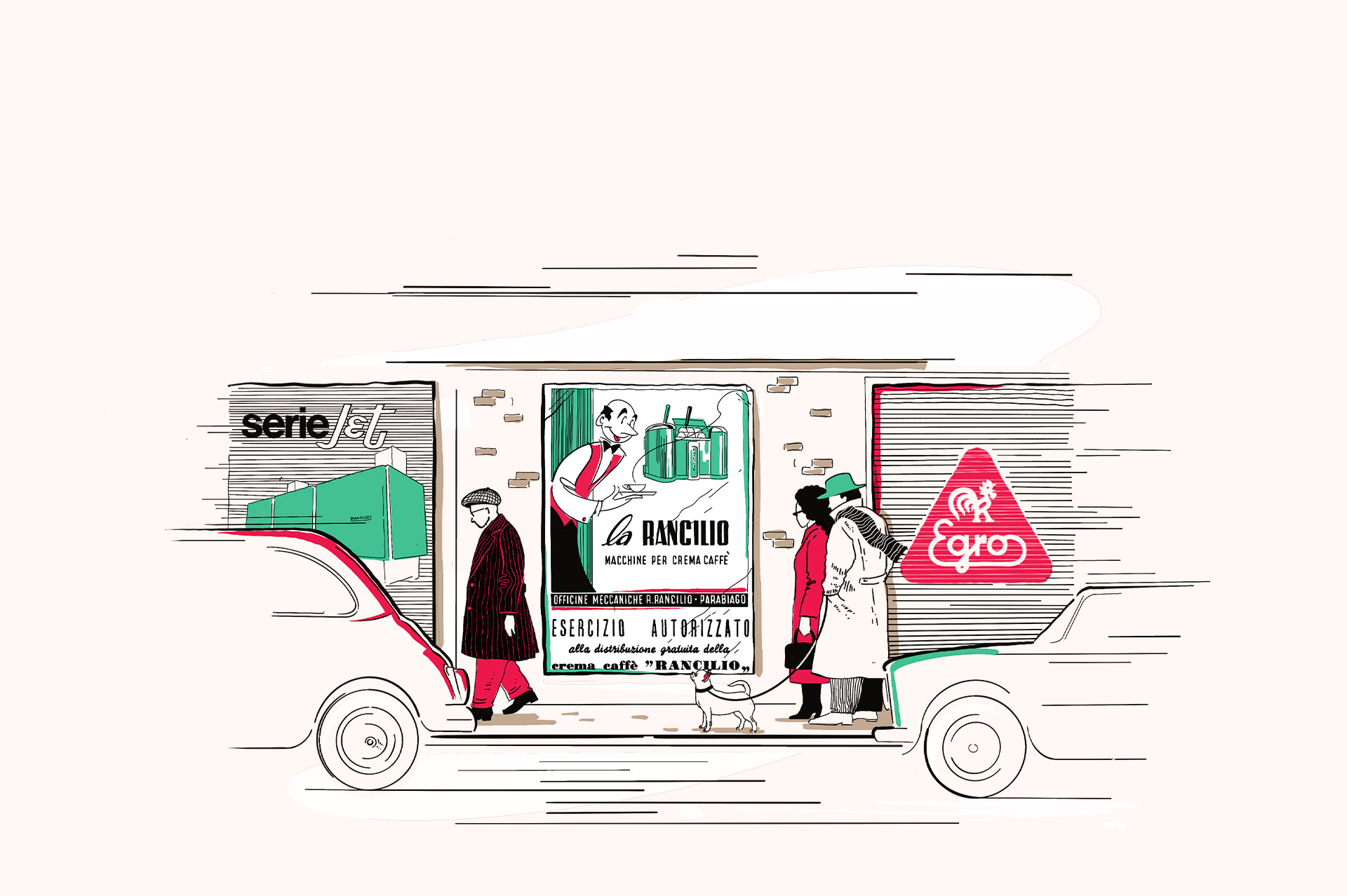
Rancilio Group unites the stories of four brands. Stories of men, intuitions, entrepreneurial dreams, technological innovations, designs and patents that, over the years, have created the myth of an international company that produces professional coffee machines.

The designers

VIEW MORE

Our communication

VIEW MORE

Get assistance on our products.

Don’t hesitate to get in touch with our support team.

Support page